Collection 60 Best Mobile Web HTML Template 2015 which is compatible and ready to use for Iphone, android, Nokia and all the mobile.
All Mobile Web Template are perfect bases for websites optimized for handheld devices.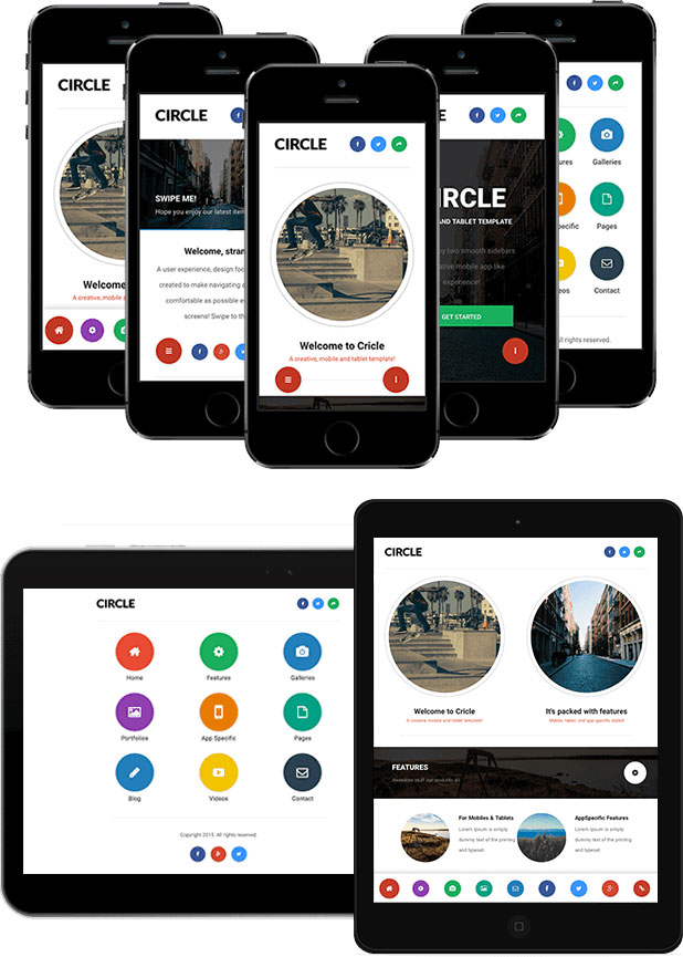
Mobile Web will help get more traffic to your website.You can find some very useful mobile website templates in this post and some nice WordPress themes with responsive design. Pick one of our beautiful and unique mobile website templates.
Satellite – Mobile & App HTML5 CSS3 Template
Satellite is a mobile template created to develop Web Sites, Web App and Native App (if integrated with PhoneGap). Thanks to a fluid layout, it suits to any type of mobile device.
PanoMobile – Mobile & Tablet Responsive Template
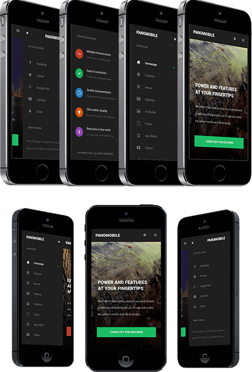
PanoMobile is a full html5 css3 mobile template with iphone web app. PanoMobile support most phones. Full support for iPhone Retina Display.
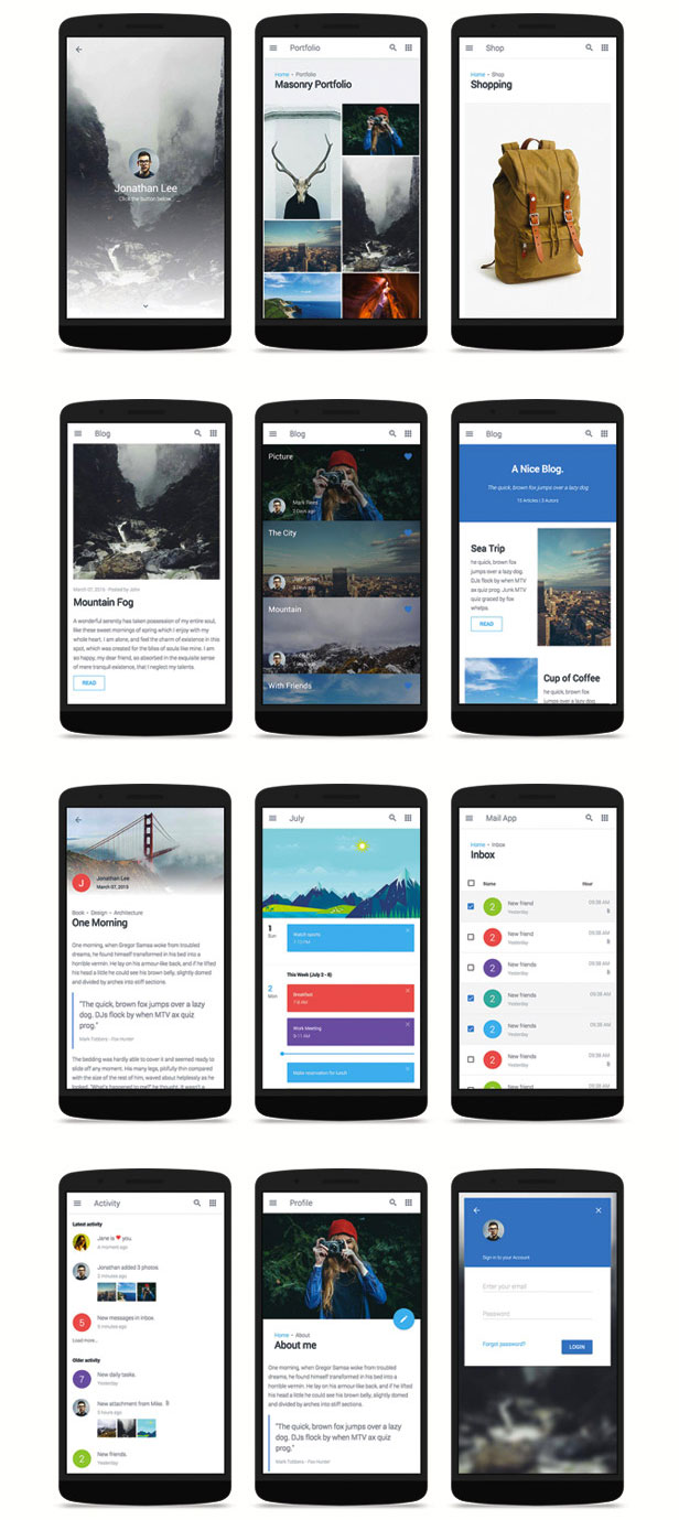
Gravity – Material Mobile & App Template
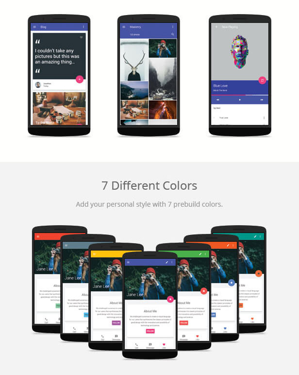
Gravity is a mobile template created to develop Web Sites, Web App and Native App (if integrated with PhoneGap). Thanks to a fluid layout, it suits to any type of mobile device.
ProMobile – Mobile & Tablet Responsive Template
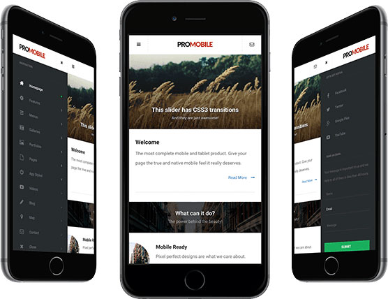
Ergonomic navigation
High Definition Graphics for high definition displays
Looks gorgeous on iOS, Nokia, Samsung, HTC, and any device with a high DPI screen and low DPI screen!
48 High definition list icons
iOS Homepage Icon
iOS Splash Screen
Washington – HTML Front-end Mobile App/Web Template
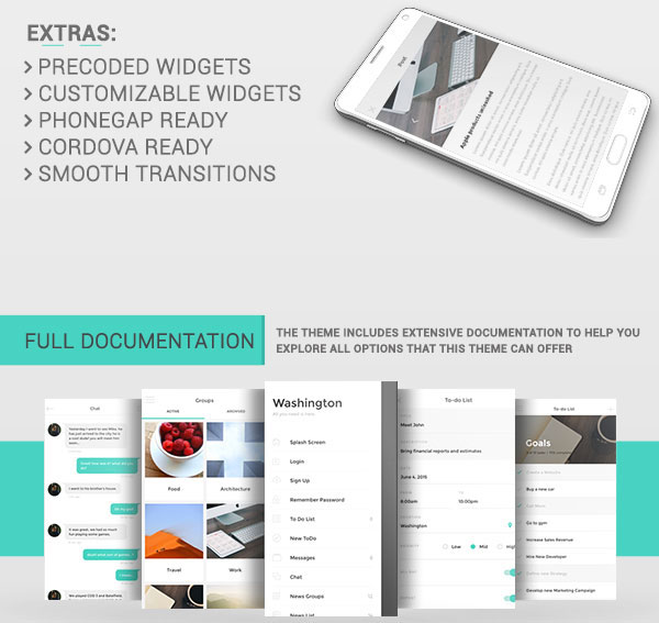
Washington is a HTML5 template which includes a wide variety of elements pre-developed and designed and a very modern and stylish design. Washington offers two different menu sidebars, a clean, high-quality design and 730+ icons to help you create a awesome app and or web mobile. The Mobile Elements incorporated allow you to easily create the app or mobile web of your dreams. Washington includes styled buttons, radio buttons, check box, input fields, toggles and many, many more.
Circle – Mobile & Tablet Responsive Template

Circle is different in every sense of the word, a round slider, 5 different menus to choose from, and 5 different homepages to choose from including a circular thumbnail styled one.
mAlpha2 – Mobile Responsive Template
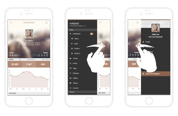
We truly believe mAlpha2 working with us can help you create any mobile application.
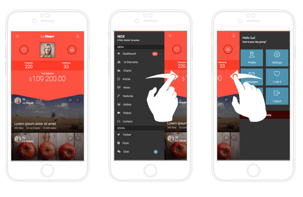
NOX – Mobile Responsive HTML5 Template
Eplie – Mobile HTML/CSS Portfolio Template
A mobile portfolio template that adapts to any mobile device. This template has no fixed sizes for specific devices, it runs on any screen size, and orientation.
Minimize – Tablet & Mobile Responsive Template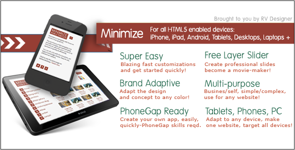
Minimize template is crisp, clean and adaptable, and is beautifully responsive. Built with HTML5 and CSS3, powered by affection and care, leveraging technology and user interface best-practices, the Minimize template is loaded with various kinds of pages and options to give your website the edge it needs.
This template is carefully handcrafted with stress on content and typography, while implementing some of the industry-standard and intuitive user interface concepts. Very quick to customize and set up, compatibility with an array of mobility devices like smartphones and tablets, a caring and quick personal support and help – the Minimize template is a well-thought decision that you could make.
mTheme
Chalis Mobile Retina – HTML5 & CSS3 And iWebApp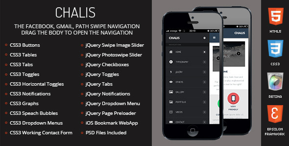
Runio – Mobile HTML/CSS Portfolio Template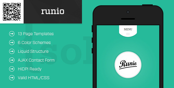
A mobile portfolio template that adapts to any mobile device. This template has no fixed sizes for specific devices, it runs on any screen size, and orientation.
My Personal Mobile Portfolio 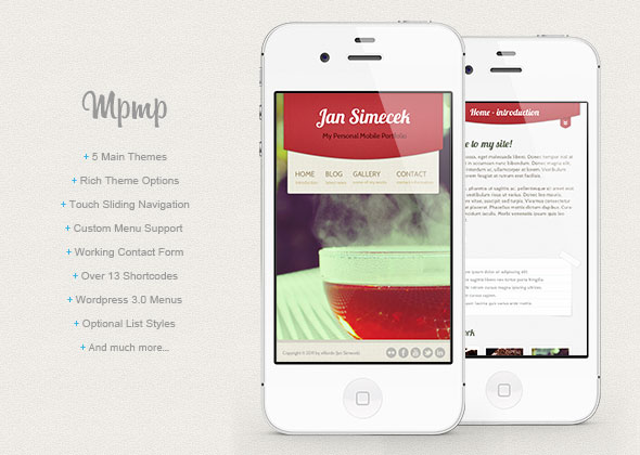
If you are looking for some portfolio and you don’t want to spend hours designing your own, this is place for you.
Resepina Mobile Retina – HTML5 & CSS3 And iWebApp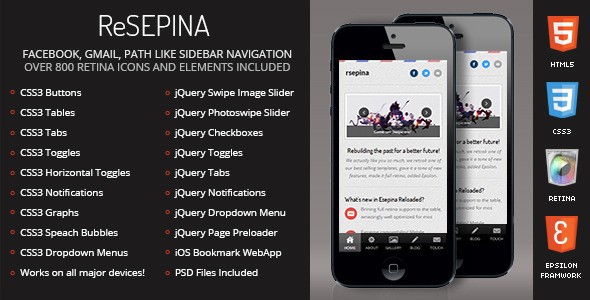
Cleary – Multipurpose Liquid Mobile Template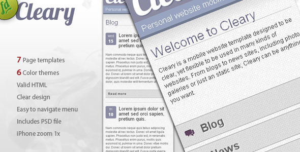
Cleary is a multipurpose mobile template designed to be easy to read and navigate within mobile devices, while keeping the size of pages down by not including big images in the blog or news lists.
While it has the most common website features (headings, paragraphs, form fields, images) it also incorporates easy to click menu links and ‘go to top’ links on every page.
I&Me Portfolio Web App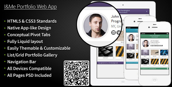
Built on pure HTML5 and CSS3, ‘I&Me Portfolio Web App’ is an HTML5 valid personal mobile portfolio website consisting of all important pages.This template is compatible across all mobile and tablet devices and also on regular desktop interfaces since it is on complete liquid layout with aesthetics in mind.
Ultimate – Your Ultimate Mobile Solutions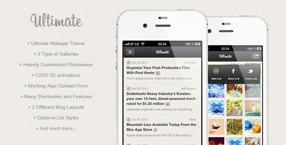
Reside Mobile Retina – HTML5 & CSS3 And iWebApp
Flaty Mobile Retina – HTML5 & CSS3 And iWebApp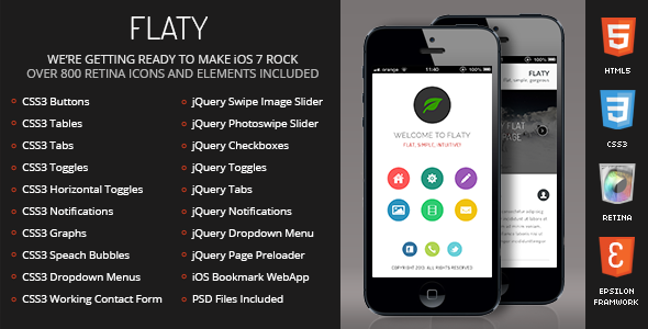
The Palace Mobile and Tablet HTML Theme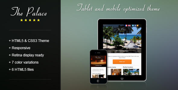
The Palace Mobile and Tablet HTML Theme is best suited to build hotel websites but it’s so versatile that you can use it for everything you want (corporate website, portfolio…)
TOUCH: a retina-ready HTML5 + CSS3 mobile template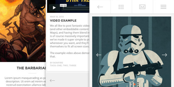
‘Touch’ is a light and airy template that makes setting up your site an utter breeze. Unlike some other templates, ‘Touch’ allows for super fast editing of your site thanks to the use of includes. For example, need to add an item to the menu? No need to go through the dull task of making the change on every single page on your site; simply edit a dedicated menu file to apply the change.
CeeVee Mobile Retina – HTML5 & CSS3 And iWebApp
Storefront Mobile – Mobile HTML Shop Template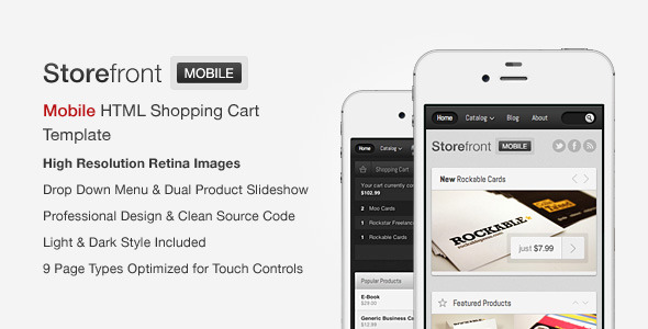
Storefront Mobile is a Mobile HTML Shopping Cart Template written in HTML5 / CSS3 which provides a convenient way for your clients to buy your products on the go and due to its clean source code and structure, it should be a breeze to integrate it into the e-commerce platform of your choice.
iBlogfolio HTML + PSD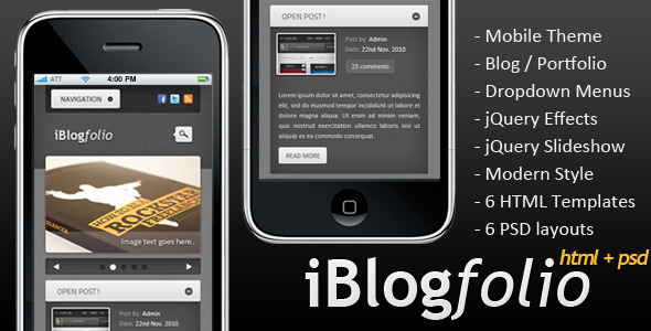
Nice and clean dark theme for application developers or mobile sites. The Site template includes jQuery behaviors for example in Navigation, Slideshow, Show/Hide Posts and Portfolio. Give it a try and test the template from your iPhone!
White Berry Responsive Business Mobile Template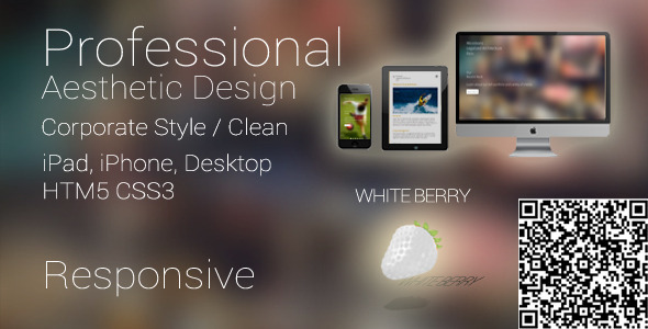
The template is dynamic / responsive, meaning, it changes it’s layout based on the browser/device width! One view for desktop, another view for mobile phones!
Touch Mobile & Tablet HTML5 Template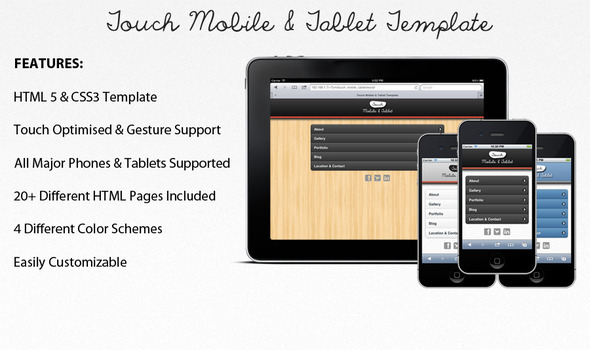
Touch Mobile & Tablet is an HTML5 and CSS3 template built for mobile and tablet devices. It is a fluid design that will adjust to screen size and orientation of the device and is suitable for business and personal sites.
The template has been built to feel like a native app with slide transitions between pages. It has a large number of HTML files that can all be easily customized to fit your needs and includes four different color schemes.
Fosile Mobile – HTML5 & CSS3 And iWebApp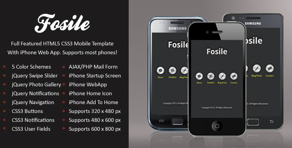
Instanav – Mobile & Tablet Responsive Template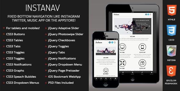
Baller Mobile Retina – HTML5 & CSS3 And iWebApp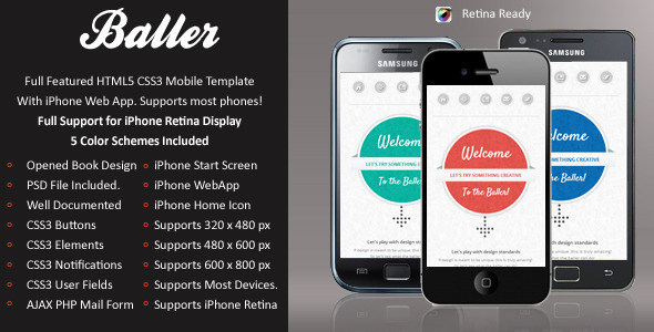
Water Mobile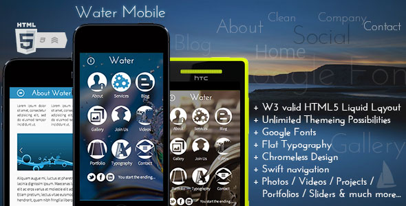
Water Mobile is a lightweight design, allowing your choice of coloration to brand your own website. It’s made to be like an app – let the mobile users not know this is a website!
Tauno – Mobile Theme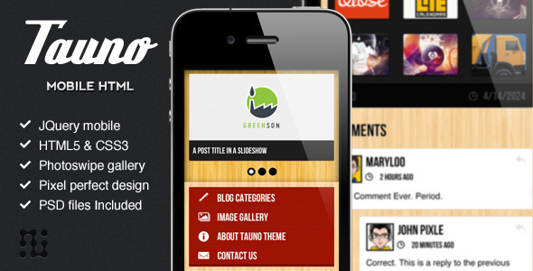
Tauno is a simple and elegant mobile theme. It is well grouped and properly layered to make the slicing process easy. The theme is designed for the Retina display resolution, ensuring that you will have a crisp and crystal clear view at the iPhone 4/4S screen.
Swipebody Mobile Retina – HTML5 & CSS3 And iWebApp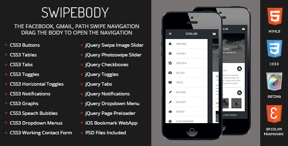
Buildy – Mobile HTML/CSS Portfolio Template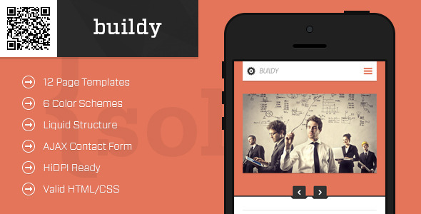
A mobile portfolio template that adapts to any mobile device. This template has no fixed sizes for specific devices, it runs on any screen size, and orientation.
Cupcake Retina-Ready Mobile Template
Lemonado – Multi-purpose Mobile Web Application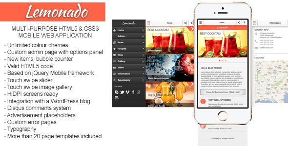
Lemonado is a multi-purpose mobile web application. It includes an admin page with extendable optional panel so it will be easy to set up your site in minutes for you or your clients.
DuoDrawer Mobile Retina – HTML5 & CSS3 And iWebApp
Restaurant Mobile Theme Meat&Recipes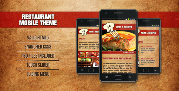
Hot Mobile theme for you restaurant. Made in HTML5 -CSS3, better view on portrait version. It contains 8 HTML -CSS-jQUERY templates to fit all your needs. Well-Layered PSD included too.
Esepina Mobile – HTML5 & CSS3 And iWebApp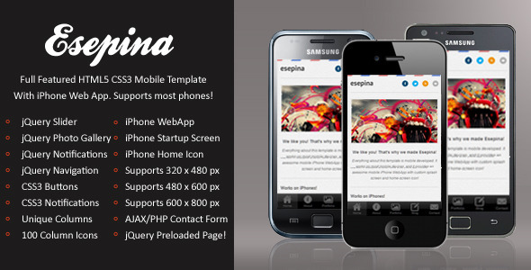
Mobile News Mirror Theme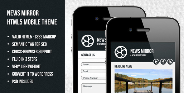
Mobile theme made for newspress, blog or magazines. Valid HTML5 , CSS3 . Made it fluid only by removing 3 css lines. Very lightweighted for fast browsing. Convert it easily into a wordpress theme!
Mobilize – Touch Optimized Mobile Template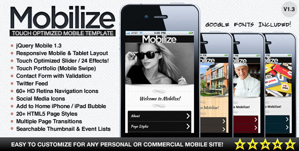
Metro Mobile Premium HTML Mobile Template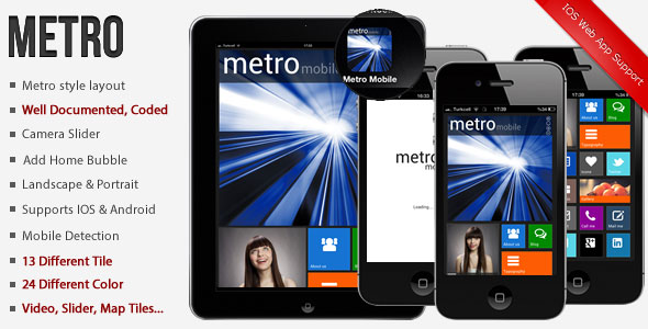
Retro Metro – SMV Creations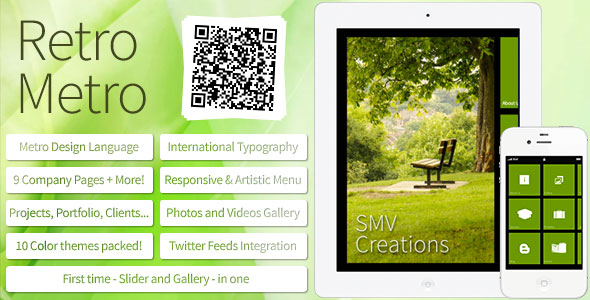
Retro Metro is built with a brand name SMV Creations.Retro Metro follows strict Metro UI Guidelines, following the design principles of classic Swiss graphic design.
WOW! mySite HTML5 & CSS3 mobile theme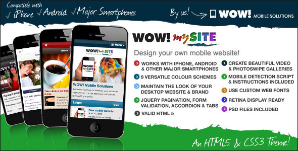
WOW! mySite is an HTML5 & CSS3 website theme optimised for mobile devices. With WOW! mySite you design your own mobile website with nine versatile colour schemes, photo galleries, video galleries, news, portfolio and contact pages and much, much more! Add your own high resolution logo and custom Google Web Fonts whilst maintaining the style and branding of your desktop website. With WOW! mySite the only limitation is your imagination!
Troller Mobile Retina – HTML5 & CSS3 And iWebApp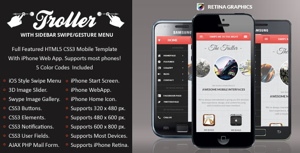
This is an awesome feature for a mobile device, it’s made to load quickly, has autoplay, and works by just taping another image to change it!
Tiger – jQuery Mobile Web Template & Web App
Tiger jQuery Mobile Template is best to use for business companies, personal blogs, portfolio pages, creative agencies, photographers and much more… Flexy design with jQuery Engine. You can use 9 different color.
Mobile Web Template – HTML5 & CSS3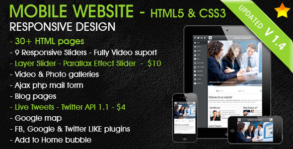
Mobile & Tablet Responsive Website Template[HTML5, CSS3] which is perfectly designed and developed for your business website.
Moderner Mobile Retina – HTML5 & CSS3 And iWebApp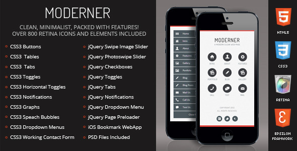
Rodin jQuery Mobile Web Template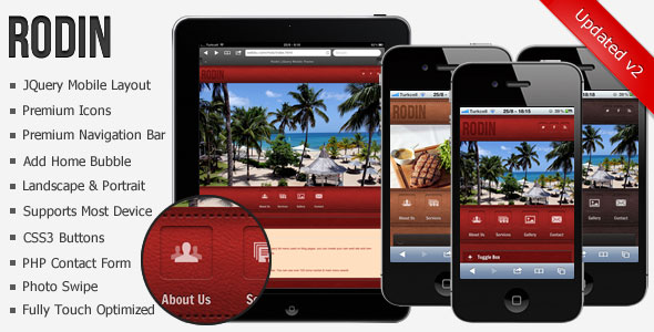
Lotus – Mobile and Tablet – HTML5 and CSS3
Finaly there’s broad HTML5 mobile template which follows newest trends (responsive layout, beautiful design, clean interface, quick support…) – successor of beautiful five-star mobile HTML5 template AxiaMobile is finaly ready for purchase!
Mobiler – Mobile & Tablet Responsive Template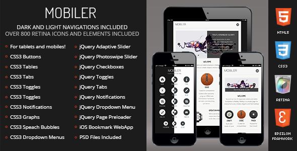
My Mobile Page V3 CSS/Html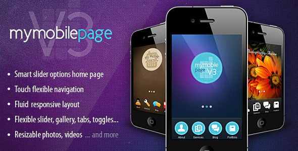
My Mobile Page V3 is the third version of “My mobile page” mobile Html/CSS template series. This version comes with a new design concept, a new functionality, improved code and some amazing features. More easy to customize and to create a new design style to suit your needs. It allready comes with 3 diferent styles included, main style theme (a blue-purple tech design), personal style design and photography style design. I have in plan uploading periodically new design styles for this version. I also accept custom requests to create unique style designs for your mobile website based on this template.
Woody – Mobile Theme 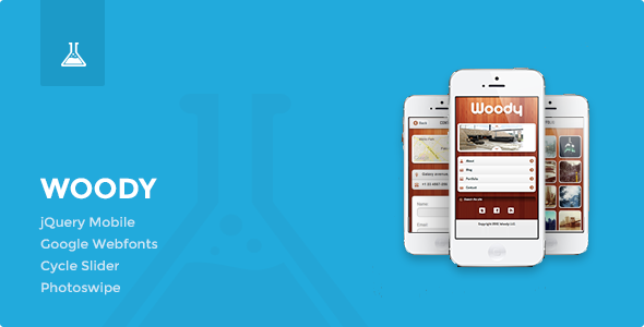
Woody is a HTML5 template optimized for mobile devices, based on the jQuery mobile framework.
MobileRush Liquid Mobile Site Template – 6 Colors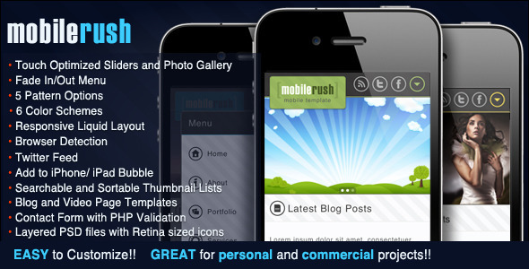
MobileRush is a clean, profesiomal HTML / CSS , touch optimized mobile website template made for mobile devices such as Android, Iphone and WP7 . Choose from 6 color themes and 5 patterns that best fit your project. Mobile Rush is easy to customize and layered PSD files have been included.
Emdot – Mobile Website & Theme Pack 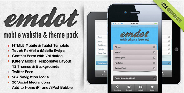
Introducing emdot, the solution to your personal or business mobile website needs. Built on jQuery mobile with a ton of great features, you’ll have your new mobile website up in no time. Use one of the 12 included color themes as is, or easily customize everything to match your branding. With @2x graphics your website will look extra sharp on the latest HD smartphones, and the touch optimized gallery will have your photos looking great on the go!
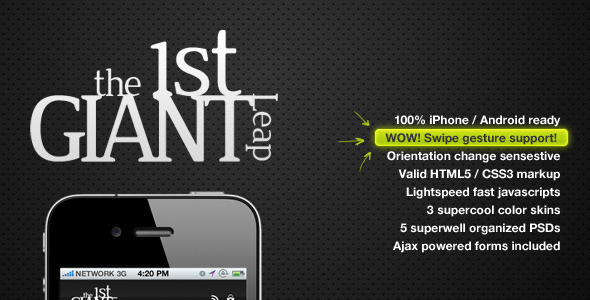
1stGiantLeap Mobile Template
121 Mobile Web Template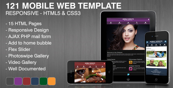
InMobile 2 – jQuery Mobile & Tablet | HTML5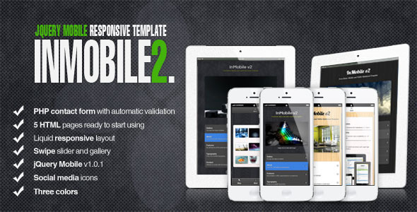
InMobile2 is HTML5 responsive template, highly optimized for mobile and tablet usage.
Black Mobile PRO HTML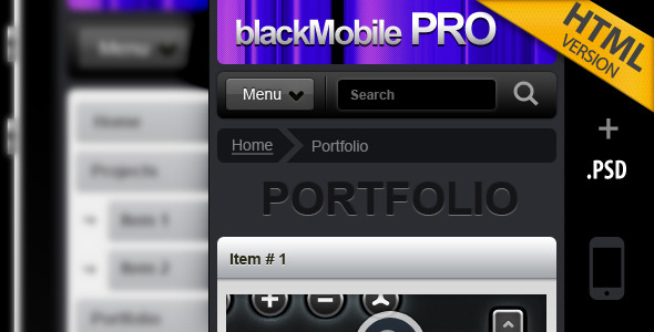
HTML version made for mobile phones.Preview on a mobile phone for best experiencesPerfect for an application developer that wants to catch the attention of everyone with a smartphone.By using a javascript accordion and a collapsable menu we managed to place a great amount of information on the small mobile screen .Made with WordPress 3.0 in mind, so you can expect the WordPress theme version pretty soon.The .psd files are modular, organized in folders (groups), to make it really easy to transfom, add or remove sections of the design.

Post a Comment Blogger Facebook